The Fondazione CRC, Cassa di Risparmio di Cuneo, (Savings Bank of Cuneo) has just celebrated 25 years of activity and they decided to mark this important achievement with a new graphic look.
The new identity project was developed by inTesta, an agency in Armando Testa Group specialising in graphic design and packaging, which was selected after a pitch to create the new image of this historical institution.
The Fondazione CRC has always been involved in a range of local projects in the Cuneo area and since 1992 it has been promoting initiatives connected to education, social solidarity, the arts, scientific research, public health and sport.
The new logo was presented on Saturday 28 January at the Toselli Theatre in Cuneo: on this occasion, well-known personalities, connected to the history and initiatives of the Fondazione, celebrated the achievements of the first twenty five years of activity and spoke of the new projects for the future.
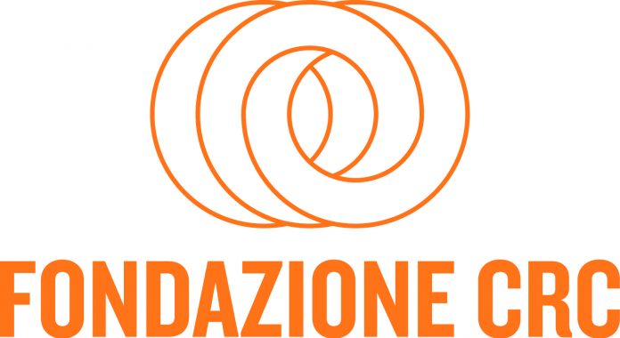
And the new elegant and versatile logo selected for the Fondazione does indeed look to the future. The logo was conceived to convey a deep sense of unity by using soft lines flowing in continuous movement: it combines the previous version by playing with circles to communicate openness to the future and local support. Continuity with the past is clear but today, more than ever, Fondazione CRC wants so focus on the very long term and above all on Cuneo, with a dynamic approach which is always elegant, and which reflects the brand perfectly: the circular shapes recall the “C” of Cuneo, pointing in a future direction. The choice of a lively colour, full of impact, reinforces this drive forward – an explosive orange, just like the sprit, which inspires the Fondazione CRC.


